# Official Features
Source: https://payloadcms.com/docs/beta/rich-text/official-features
Below are all the Rich Text Features Payload offers. Everything is customizable; you can [create your own features](/docs/v4/rich-text/custom-features.md), modify ours and share them with the community.
## Features Overview
| Feature Name | Included by default | Description |
| --------------------------- | ------------------- | ----------------------------------------------------------------------------------------------------------------------------------------------------------------------------------- |
| **`BoldFeature`** | Yes | Adds support for bold text formatting. |
| **`ItalicFeature`** | Yes | Adds support for italic text formatting. |
| **`UnderlineFeature`** | Yes | Adds support for underlined text formatting. |
| **`StrikethroughFeature`** | Yes | Adds support for strikethrough text formatting. |
| **`SubscriptFeature`** | Yes | Adds support for subscript text formatting. |
| **`SuperscriptFeature`** | Yes | Adds support for superscript text formatting. |
| **`InlineCodeFeature`** | Yes | Adds support for inline code formatting. |
| **`ParagraphFeature`** | Yes | Provides entries in both the slash menu and toolbar dropdown for explicit paragraph creation or conversion. |
| **`HeadingFeature`** | Yes | Adds Heading Nodes (by default, H1 - H6, but that can be customized) |
| **`AlignFeature`** | Yes | Adds support for text alignment (left, center, right, justify) |
| **`IndentFeature`** | Yes | Adds support for text indentation with toolbar buttons |
| **`UnorderedListFeature`** | Yes | Adds support for unordered lists (ul) |
| **`OrderedListFeature`** | Yes | Adds support for ordered lists (ol) |
| **`ChecklistFeature`** | Yes | Adds support for interactive checklists |
| **`LinkFeature`** | Yes | Allows you to create internal and external links |
| **`RelationshipFeature`** | Yes | Allows you to create block-level (not inline) relationships to other documents |
| **`BlockquoteFeature`** | Yes | Allows you to create block-level quotes |
| **`UploadFeature`** | Yes | Allows you to create block-level upload nodes - this supports all kinds of uploads, not just images |
| **`HorizontalRuleFeature`** | Yes | Adds support for horizontal rules / separators. Basically displays an `
` element |
| **`InlineToolbarFeature`** | Yes | Provides a floating toolbar which appears when you select text. This toolbar only contains actions relevant for selected text |
| **`FixedToolbarFeature`** | No | Provides a persistent toolbar pinned to the top and always visible. Both inline and fixed toolbars can be enabled at the same time. |
| **`BlocksFeature`** | No | Allows you to use Payload's [Blocks Field](/docs/v4/fields/blocks.md) directly inside your editor. In the feature props, you can specify the allowed blocks - just like in the Blocks field. |
| **`TreeViewFeature`** | No | Provides a debug box under the editor, which allows you to see the current editor state live, the dom, as well as time travel. Very useful for debugging |
| **`TableFeature`** | No | Adds support for tables, with a toolbar button and slash menu entry for creation and editing. |
| **`TextStateFeature`** | No | Allows you to store key-value attributes within TextNodes and assign them inline styles. |
## In depth
### BoldFeature
- Description: Adds support for bold text formatting, along with buttons to apply it in both fixed and inline toolbars.
- Included by default: Yes
- Markdown Support: `**bold**` or `__bold__`
- Keyboard Shortcut: Ctrl/Cmd + B
### ItalicFeature
- Description: Adds support for italic text formatting, along with buttons to apply it in both fixed and inline toolbars.
- Included by default: Yes
- Markdown Support: `*italic*` or `_italic_`
- Keyboard Shortcut: Ctrl/Cmd + I
### UnderlineFeature
- Description: Adds support for underlined text formatting, along with buttons to apply it in both fixed and inline toolbars.
- Included by default: Yes
- Keyboard Shortcut: Ctrl/Cmd + U
### StrikethroughFeature
- Description: Adds support for strikethrough text formatting, along with buttons to apply it in both fixed and inline toolbars.
- Included by default: Yes
- Markdown Support: `~~strikethrough~~`
### SubscriptFeature
- Description: Adds support for subscript text formatting, along with buttons to apply it in both fixed and inline toolbars.
- Included by default: Yes
### SuperscriptFeature
- Description: Adds support for superscript text formatting, along with buttons to apply it in both fixed and inline toolbars.
- Included by default: Yes
### InlineCodeFeature
- Description: Adds support for inline code formatting with distinct styling, along with buttons to apply it in both fixed and inline toolbars.
- Included by default: Yes
- Markdown Support: \`code\`
### ParagraphFeature
- Description: Provides entries in both the slash menu and toolbar dropdown for explicit paragraph creation or conversion.
- Included by default: Yes
### HeadingFeature
- Description: Adds support for heading nodes (H1-H6) with toolbar dropdown and slash menu entries for each enabled heading size.
- Included by default: Yes
- Markdown Support: `#`, `##`, `###`, ..., at start of line.
- Types:
```ts
type HeadingFeatureProps = {
enabledHeadingSizes?: HeadingTagType[] // ['h1', 'h2', 'h3', 'h4', 'h5', 'h6']
}
```
- Usage example:
```ts
HeadingFeature({
enabledHeadingSizes: ['h1', 'h2', 'h3'], // Default: ['h1', 'h2', 'h3', 'h4', 'h5', 'h6']
})
```
### AlignFeature
- Description: Allows text alignment (left, center, right, justify), along with buttons to apply it in both fixed and inline toolbars.
- Included by default: Yes
- Keyboard Shortcut: Ctrl/Cmd + Shift + L/E/R/J (left/center/right/justify)
### IndentFeature
- Description: Adds support for text indentation, along with buttons to apply it in both fixed and inline toolbars.
- Included by default: Yes
- Keyboard Shortcut: Tab (increase), Shift + Tab (decrease)
- Types:
```ts
type IndentFeatureProps = {
/**
* The nodes that should not be indented. "type"
* property of the nodes you don't want to be indented.
* These can be: "paragraph", "heading", "listitem",
* "quote" or other indentable nodes if they exist.
*/
disabledNodes?: string[]
/**
* If true, pressing Tab in the middle of a block such
* as a paragraph or heading will not insert a tabNode.
* Instead, Tab will only be used for block-level indentation.
* @default false
*/
disableTabNode?: boolean
}
```
- Usage example:
```ts
// Allow block-level indentation only
IndentFeature({
disableTabNode: true,
})
```
### UnorderedListFeature
- Description: Adds support for unordered lists (bullet points) with toolbar dropdown and slash menu entries.
- Included by default: Yes
- Markdown Support: `-`, `*`, or `+` at start of line
### OrderedListFeature
- Description: Adds support for ordered lists (numbered lists) with toolbar dropdown and slash menu entries.
- Included by default: Yes
- Markdown Support: `1.` at start of line
### ChecklistFeature
- Description: Adds support for interactive checklists with toolbar dropdown and slash menu entries.
- Included by default: Yes
- Markdown Support: `- [ ]` (unchecked) or `- [x]` (checked)
### LinkFeature
- Description: Allows creation of internal and external links with toolbar buttons and automatic URL conversion.
- Included by default: Yes
- Markdown Support: `[anchor](url)`
- Types:
```ts
type LinkFeatureServerProps = {
/**
* Disables the automatic creation of links
* from URLs typed or pasted into the editor,
* @default false
*/
disableAutoLinks?: 'creationOnly' | true
/**
* A function or array defining additional
* fields for the link feature.
* These will be displayed in the link editor drawer.
*/
fields?:
| ((args: {
config: SanitizedConfig
defaultFields: FieldAffectingData[]
}) => (Field | FieldAffectingData)[])
| Field[]
/**
* Sets a maximum population depth for the internal
* doc default field of link, regardless of the
* remaining depth when the field is reached.
*/
maxDepth?: number
} & ExclusiveLinkCollectionsProps
type ExclusiveLinkCollectionsProps =
| {
disabledCollections?: CollectionSlug[]
enabledCollections?: never
}
| {
disabledCollections?: never
enabledCollections?: CollectionSlug[]
}
```
- Usage example:
```ts
LinkFeature({
fields: ({ defaultFields }) => [
...defaultFields,
{
name: 'rel',
type: 'select',
options: ['noopener', 'noreferrer', 'nofollow'],
},
],
enabledCollections: ['pages', 'posts'], // Collections for internal links
maxDepth: 2, // Population depth for internal links
disableAutoLinks: false, // Allow auto-conversion of URLs
})
```
### RelationshipFeature
- Description: Allows creation of block-level relationships to other documents with toolbar button and slash menu entry.
- Included by default: Yes
- Types:
```ts
type RelationshipFeatureProps = {
/**
* Sets a maximum population depth for this relationship,
* regardless of the remaining depth when the respective
* field is reached.
*/
maxDepth?: number
} & ExclusiveRelationshipFeatureProps
type ExclusiveRelationshipFeatureProps =
| {
disabledCollections?: CollectionSlug[]
enabledCollections?: never
}
| {
disabledCollections?: never
enabledCollections?: CollectionSlug[]
}
```
- Usage example:
```ts
RelationshipFeature({
disabledCollections: ['users'], // Collections to exclude
maxDepth: 2, // Population depth for relationships
})
```
### UploadFeature
- Description: Allows creation of upload/media nodes with toolbar button and slash menu entry, supports all file types.
- Included by default: Yes
- Types:
```ts
type UploadFeatureProps = {
collections?: {
[collection: UploadCollectionSlug]: {
fields: Field[]
}
}
/**
* Sets a maximum population depth for this upload (not the fields for this upload), regardless of the remaining depth when the respective field is reached.
* This behaves exactly like the maxDepth properties of relationship and upload fields.
*
* {@link ../getting-started/concepts#field-level-max-depth}
*/
maxDepth?: number
} & ExclusiveUploadFeatureProps
type ExclusiveUploadFeatureProps =
| {
/**
* The collections that should be disabled. Overrides the `enableRichTextRelationship` property in the collection config.
* When this property is set, `enabledCollections` will not be available.
**/
disabledCollections?: UploadCollectionSlug[]
// Ensures that enabledCollections is not available when disabledCollections is set
enabledCollections?: never
}
| {
// Ensures that disabledCollections is not available when enabledCollections is set
disabledCollections?: never
/**
* The collections that should be enabled. Overrides the `enableRichTextRelationship` property in the collection config
* When this property is set, `disabledCollections` will not be available.
**/
enabledCollections?: UploadCollectionSlug[]
}
```
- Usage example:
```ts
UploadFeature({
collections: {
uploads: {
fields: [
{
name: 'caption',
type: 'text',
label: 'Caption',
},
{
name: 'alt',
type: 'text',
label: 'Alt Text',
},
],
},
},
maxDepth: 1, // Population depth for uploads
disabledCollections: ['specialUploads'], // Collections to exclude
})
```
### BlockquoteFeature
- Description: Allows creation of blockquotes with toolbar button and slash menu entry.
- Included by default: Yes
- Markdown Support: `> quote text`
### HorizontalRuleFeature
- Description: Adds support for horizontal rules/separators with toolbar button and slash menu entry.
- Included by default: Yes
- Markdown Support: `---`
### InlineToolbarFeature
- Description: Provides a floating toolbar that appears when text is selected, containing formatting options relevant to selected text.
- Included by default: Yes
### FixedToolbarFeature
- Description: Provides a persistent toolbar pinned to the top of the editor that's always visible.
- Included by default: No
- Types:
```ts
type FixedToolbarFeatureProps = {
/**
* @default false
* If this is enabled, the toolbar will apply
* to the focused editor, not the editor with
* the FixedToolbarFeature.
*/
applyToFocusedEditor?: boolean
/**
* Custom configurations for toolbar groups
* Key is the group key (e.g. 'format', 'indent', 'align')
* Value is a partial ToolbarGroup object that will
* be merged with the default configuration
*/
customGroups?: CustomGroups
/**
* @default false
* If there is a parent editor with a fixed toolbar,
* this will disable the toolbar for this editor.
*/
disableIfParentHasFixedToolbar?: boolean
}
```
- Usage example:
```ts
FixedToolbarFeature({
applyToFocusedEditor: false, // Apply to focused editor
customGroups: {
format: {
// Custom configuration for format group
},
},
})
```
### BlocksFeature
- Description: Allows use of Payload's [Blocks Field](/docs/v4/fields/blocks.md) directly in the editor with toolbar buttons and slash menu entries for each block type. Supports both block-level and inline blocks.
- Included by default: No
For complete documentation including custom block components, the pre-built CodeBlock, and rendering blocks on the frontend, see the dedicated [Blocks documentation](/docs/v4/rich-text/blocks.md).
### TreeViewFeature
- Description: Provides a debug panel below the editor showing the editor's internal state, DOM tree, and time travel debugging.
- Included by default: No
### TableFeature
- Description: Adds support for tables with toolbar button and slash menu entry for creation and editing.
- Included by default: No
### TextStateFeature
- Description: Allows storing key-value attributes in text nodes with inline styles and toolbar dropdown for style selection.
- Included by default: No
- Types:
```ts
type TextStateFeatureProps = {
/**
* The keys of the top-level object (stateKeys) represent the attributes that the textNode can have (e.g., color).
* The values of the top-level object (stateValues) represent the values that the attribute can have (e.g., red, blue, etc.).
* Within the stateValue, you can define inline styles and labels.
*/
state: { [stateKey: string]: StateValues }
}
type StateValues = {
[stateValue: string]: {
css: StyleObject
label: string
}
}
type StyleObject = {
[K in keyof PropertiesHyphenFallback]?:
| Extract
| undefined
}
```
- Usage example:
```ts
// We offer default colors that have good contrast and look good in dark and light mode.
import { defaultColors, TextStateFeature } from '@payloadcms/richtext-lexical'
TextStateFeature({
// prettier-ignore
state: {
color: {
...defaultColors,
// fancy gradients!
galaxy: { label: 'Galaxy', css: { background: 'linear-gradient(to right, #0000ff, #ff0000)', color: 'white' } },
sunset: { label: 'Sunset', css: { background: 'linear-gradient(to top, #ff5f6d, #6a3093)' } },
},
// You can have both colored and underlined text at the same time.
// If you don't want that, you should group them within the same key.
// (just like I did with defaultColors and my fancy gradients)
underline: {
'solid': { label: 'Solid', css: { 'text-decoration': 'underline', 'text-underline-offset': '4px' } },
// You'll probably want to use the CSS light-dark() utility.
'yellow-dashed': { label: 'Yellow Dashed', css: { 'text-decoration': 'underline dashed', 'text-decoration-color': 'light-dark(#EAB308,yellow)', 'text-underline-offset': '4px' } },
},
},
}),
```
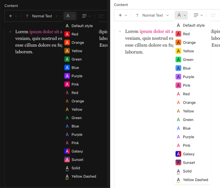
This is what the example above will look like:
#### Rendering on the frontend
When Lexical serializes a text node that has state applied, the state is stored under a `"$"` key in the node object. To apply the styles when rendering rich text on your frontend, you need a custom `text` JSX converter that reads from this key and maps the values back to your CSS config.
**Step 1 — Share your state config**
Extract your `TextStateFeature` state into a file with no package imports so it can be safely imported in both server and client contexts:
```ts
// src/fields/textStateConfig.ts
export const textStateConfig = {
color: {
'text-red': {
label: 'Red',
css: {
color:
'light-dark(oklch(0.577 0.245 27.325), oklch(0.704 0.191 22.216))',
},
},
'text-blue': {
label: 'Blue',
css: {
color:
'light-dark(oklch(0.546 0.245 262.881), oklch(0.707 0.165 254.624))',
},
},
// ...other colors
},
} as const
```
Then reference it in your field config:
```ts
// src/blocks/Content/config.ts
import { TextStateFeature, lexicalEditor } from '@payloadcms/richtext-lexical'
import { textStateConfig } from '@/fields/textStateConfig'
{
name: 'richText',
type: 'richText',
editor: lexicalEditor({
features: ({ rootFeatures }) => [
...rootFeatures,
TextStateFeature({
state: {
color: textStateConfig.color,
},
}),
],
}),
}
```
**Step 2 — Add a custom text converter**
When using [`RichText` from `@payloadcms/richtext-lexical/react`](/docs/v4/rich-text/converting-jsx.md#richtext-to-jsx), override the default `text` converter to read the `"$"` key and apply the corresponding CSS as inline styles:
```tsx
// src/components/RichText/index.tsx
import { textStateConfig } from '@/fields/textStateConfig'
import {
JSXConvertersFunction,
RichText as ConvertRichText,
} from '@payloadcms/richtext-lexical/react'
// Lexical serializes node state under the "$" key.
const NODE_STATE_KEY = '$'
// React's style prop requires camelCase, but TextStateFeature CSS uses hyphen-case.
function hyphenToCamel(str: string): string {
return str.replace(/-([a-z])/g, (_, letter: string) => letter.toUpperCase())
}
const jsxConverters: JSXConvertersFunction = ({ defaultConverters }) => ({
...defaultConverters,
text: (args) => {
const { node } = args
// Render standard formatting (bold, italic, etc.) using the default converter
let text =
typeof defaultConverters.text === 'function'
? defaultConverters.text(args)
: node.text
// Apply TextStateFeature styles from the "$" key in the serialized node
const nodeState = (node as any)[NODE_STATE_KEY] as
| Record
| undefined
if (nodeState) {
const styles: React.CSSProperties = {}
for (const [stateKey, stateValue] of Object.entries(nodeState)) {
const css = (textStateConfig as any)[stateKey]?.[stateValue]?.css
if (css) {
for (const [prop, value] of Object.entries(css)) {
;(styles as any)[hyphenToCamel(prop)] = value
}
}
}
if (Object.keys(styles).length > 0) {
text = {text}
}
}
return text
},
})
export default function RichText({ data, ...rest }) {
return
}
```
The key insight is that `textStateConfig` is the single source of truth — it is passed directly to `TextStateFeature` in your field config and also imported by your frontend converter to resolve the CSS values at render time.