Next
Blocks Field
The Blocks Field is one of the most flexible tools in Payload. It stores an array of objects, where each object is a “block” with its own schema. Unlike a simple array (where every item looks the same), blocks let you mix and match different content types in any order.
This makes Blocks perfect for building dynamic, editor-friendly experiences, such as:
- A page builder with blocks like
Quote,CallToAction,Slider, orGallery. - A form builder with block types like
Text,Select, orCheckbox. - An event agenda where each timeslot could be a
Break,Presentation, orBreakoutSession.
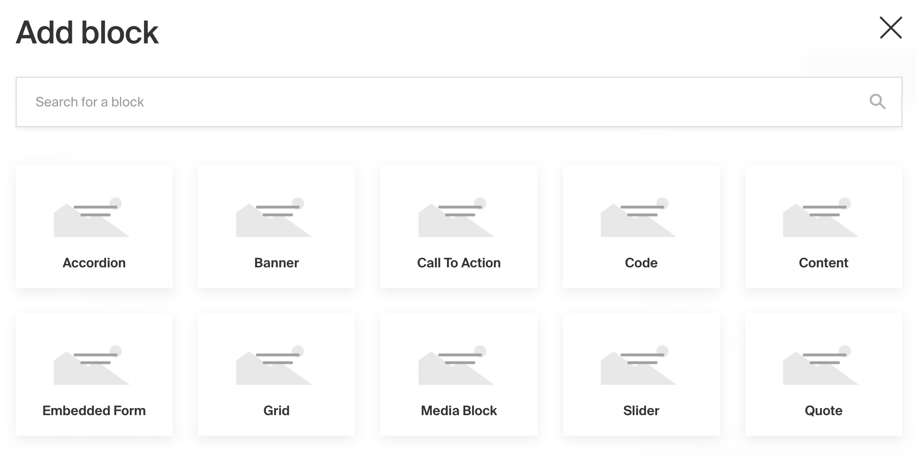
Admin Panel screenshot of add Blocks drawer view
To add a Blocks Field, set the type to blocks in your Field Config:
1
import type { Field } from 'payload'
2
3
export const MyBlocksField: Field = {
4
// ...
5
type: 'blocks',
6
blocks: [
7
// ...
8
],
9
}
This page is divided into two parts: first, the settings of the Blocks Field, and then the settings of the blocks inside it.
Block Field
Block Config Options
Option | Description |
|---|---|
| To be used as the property name when stored and retrieved from the database. More details. |
| Text used as the heading in the Admin Panel or an object with keys for each language. Auto-generated from name if not defined. |
| Array of block configs to be made available to this field. |
| Provide a custom validation function that will be executed on both the Admin Panel and the backend. More details. |
| A number for the fewest allowed items during validation when a value is present. |
| A number for the most allowed items during validation when a value is present. |
| If this field is top-level and nested in a config supporting Authentication, include its data in the user JWT. |
| Provide Field Hooks to control logic for this field. More details. |
| Provide Field Access Control to denote what users can see and do with this field's data. More details. |
| Restrict this field's visibility from all APIs entirely. Will still be saved to the database, but will not appear in any API response or the Admin Panel. |
| Provide an array of block data to be used for this field's default value. More details. |
| Enable localization for this field. Requires localization to be enabled in the Base config. If enabled, a separate, localized set of all data within this field will be kept, so there is no need to specify each nested field as |
| Enforce that each entry in the Collection has a unique value for this field. |
| Customize the block row labels appearing in the Admin dashboard. |
| Admin-specific configuration. More details. |
| Extension point for adding custom data (e.g. for plugins) |
| Override field type generation with providing a JSON schema |
| Provide |
* An asterisk denotes that a property is required.
Block Admin Options
To customize the appearance and behavior of the Blocks Field in the Admin Panel, you can use the admin option:
1
import type { Field } from 'payload'
2
3
export const MyBlocksField: Field = {
4
// ...
5
admin: {
6
7
// ...
8
},
9
}
The Blocks Field inherits all of the default admin options from the base Field Admin Config, plus the following additional options:
Option | Description |
|---|---|
| Set the initial collapsed state |
| Disable order sorting by setting this value to |
Customizing the way your block is rendered in Lexical
If you're using this block within the Lexical editor, you can also customize how the block is rendered in the Lexical editor itself by specifying custom components.
admin.components.Label- pass a custom React component here to customize the way that the label is rendered for this blockadmin.components.Block- pass a component here to completely override the way the block is rendered in Lexical with your own component
This is super handy if you'd like to present your editors with a very deliberate and nicely designed block "preview" right in your rich text.
For example, if you have a gallery block, you might want to actually render the gallery of images directly in your Lexical block. With the admin.components.Block property, you can do exactly that!
To import these utility components for one of your custom blocks, you can import the following:
1
import {
2
// Edit block buttons (choose the one that corresponds to your usage)
3
// When clicked, this will open a drawer with your block's fields
4
// so your editors can edit them
5
InlineBlockEditButton,
6
BlockEditButton,
7
8
// Buttons that will remove this block from Lexical
9
// (choose the one that corresponds to your usage)
10
InlineBlockRemoveButton,
11
BlockRemoveButton,
12
13
// The label that should be rendered for an inline block
14
InlineBlockLabel,
15
16
// The default "container" that is rendered for an inline block
17
// if you want to re-use it
18
InlineBlockContainer,
19
20
// The default "collapsible" UI that is rendered for a regular block
21
// if you want to re-use it
22
BlockCollapsible,
23
} from '@payloadcms/richtext-lexical/client'
Copying and Pasting Blocks
The Admin Panel includes built-in copy and paste support for both individual block rows and entire Blocks fields. This is available through the row action menu (the ... button on each block) and from the field-level action menu in the field header.
Row-level vs. Field-level
- Row copy/paste — copies a single block and lets you paste it into any position within any compatible Blocks field
- Field copy/paste — copies all blocks in the field at once and pastes them as the full contents of a target field, replacing whatever was there
How it differs from Duplicate
The Duplicate action creates an immediate in-place copy of a block, inserted directly below the original — always within the same field on the same document.
Copy/paste is designed for moving data across fields or documents:
- Copy a block on
Page A, openPage B, and paste it into that page's blocks field - Copy a block from one Blocks field and paste it into a different Blocks field on the same document
How it works
Copied data is written to localStorage under the key _payloadClipboard. This means:
- The clipboard persists across browser tabs (same origin)
- It is not shared between different Payload origins
When pasting, Payload validates that the copied block type exists in the target field's blocks config. If the schemas are incompatible, the paste action will not be available. All block and nested array IDs are automatically regenerated on paste to prevent duplicate key errors.
Blocks Items
Config Options
Blocks are defined as separate configs of their own.
Option | Description |
|---|---|
| Identifier for this block type. Will be saved on each block as the |
| Array of fields to be stored in this block. |
| Customize the block labels that appear in the Admin dashboard. Auto-generated from slug if not defined. Alternatively you can use |
| Create a top level, reusable Typescript interface & GraphQL type. |
| Text to use for the GraphQL schema name. Auto-generated from slug if not defined. NOTE: this is set for deprecation, prefer |
| Custom table name for this block type when using SQL Database Adapter (Postgres). Auto-generated from slug if not defined. |
| Extension point for adding custom data (e.g. for plugins) |
* An asterisk denotes that a property is required.
Admin Options
Blocks are not fields, so they don’t inherit the base properties shared by all fields (not to be confused with the Blocks Field, documented above, which does). Here are their available admin options:
Option | Description |
|---|---|
| Custom component for replacing the Block, including the header. |
| Custom component for replacing the Block Label. |
| Hide the blockName field by setting this value to |
| Text or localization object used to group this Block in the Blocks Drawer. |
| Extension point for adding custom data (e.g. for plugins) |
| Custom images for the block in different UI contexts. Supports |
|
Block Image Guidelines
The images property lets you provide custom images for each display context:
images.icon- Small icon for Lexical editor menus and toolbars (displayed at 20x20px)images.thumbnail- Larger thumbnail for block selection drawer (3:2 aspect ratio)
Each can be either a plain URL string or an object { url: string, alt?: string }.
Icon (images.icon)
Used in Lexical editor slash menus, toolbar dropdowns, and inline block menus.
Requirements:
- Displayed at 20x20 pixels
- Square images (1:1 aspect ratio) work best
- Falls back to
images.thumbnail, then to default block icon
Recommendations:
- Use SVG for crisp rendering at small sizes
- Keep designs simple with bold shapes
- Provide web-optimized images (SVG, PNG with transparency)
Thumbnail (images.thumbnail)
Used in the block selection drawer when editors add blocks to a blocks field.
Requirements:
- 3:2 aspect ratio (e.g., 480x320, 600x400, 900x600)
- Images are scaled using
object-fit: cover - Non-matching aspect ratios will be cropped to fill the container
Recommendations:
- Use images with 3:2 aspect ratio to avoid unwanted cropping
- Keep important visual content centered in your image
- Provide web-optimized images (JPEG, PNG, WebP) for faster loading
Usage Examples
Example 1: Using both icon and thumbnail with alt text
1
const QuoteBlock: Block = {
2
slug: 'quote',
3
admin: {
4
images: {
5
icon: {
6
url: 'https://example.com/icons/quote-icon-20x20.svg',
7
alt: 'Quote icon',
8
},
9
thumbnail: {
10
url: 'https://example.com/thumbnails/quote-block-480x320.jpg',
11
alt: 'Quote block',
12
},
13
},
14
},
15
fields: [
16
{
17
name: 'quoteText',
18
type: 'text',
19
required: true,
20
},
21
],
22
}
Example 2: Using URL strings (no alt text)
1
const CallToActionBlock: Block = {
2
slug: 'cta',
3
admin: {
4
images: {
5
icon: 'https://example.com/icons/cta-20x20.svg',
6
thumbnail: 'https://example.com/thumbnails/cta-block-480x320.jpg',
7
},
8
},
9
fields: [
10
{
11
name: 'buttonText',
12
type: 'text',
13
},
14
],
15
}
Example 3: Using only icon
1
const DividerBlock: Block = {
2
slug: 'divider',
3
admin: {
4
images: {
5
icon: 'https://example.com/icons/divider-20x20.svg',
6
},
7
},
8
fields: [],
9
}
If no images is provided, default graphics are displayed automatically in both contexts.
blockType, blockName, and block.label
Each block stores two pieces of data alongside your fields. The blockType identifies which schema to use and it is exactly the block’s slug. The blockName is an optional label you can give to a block to make editing and scanning easier.
The label is shared by all blocks of the same type and is defined in the block config via label with a fallback to slug. On the other hand, the blockName is specific to each block individually. You can hide the editable name with admin.disableBlockName.
If you provide admin.components.Label, that component replaces both the name and the label in the Admin UI.
Property | Scope | Source | Visible in UI | Notes |
|---|---|---|---|---|
| Each block | The block’s | Not a header | Used to resolve which block schema to render |
| Each block | Editor input in the Admin | Yes | Optional label; hide with |
| Block type | | Yes | Shared by all blocks of that type. Can be replaced with custom |
Custom Components
Field
Server Component
1
import type React from 'react'
2
import { BlocksField } from '@payloadcms/ui'
3
import type { BlocksFieldServerComponent } from 'payload'
4
5
export const CustomBlocksFieldServer: BlocksFieldServerComponent = ({
6
clientField,
7
path,
8
schemaPath,
9
permissions,
10
}) => {
11
return (
12
<BlocksField
13
field={clientField}
14
path={path}
15
schemaPath={schemaPath}
16
permissions={permissions}
17
/>
18
)
19
}
Client Component
1
'use client'
2
import React from 'react'
3
import { BlocksField } from '@payloadcms/ui'
4
import type { BlocksFieldClientComponent } from 'payload'
5
6
export const CustomBlocksFieldClient: BlocksFieldClientComponent = (props) => {
7
return <BlocksField {...props} />
8
}
Label
Server Component
1
import React from 'react'
2
import { FieldLabel } from '@payloadcms/ui'
3
import type { BlocksFieldLabelServerComponent } from 'payload'
4
5
export const CustomBlocksFieldLabelServer: BlocksFieldLabelServerComponent = ({
6
clientField,
7
path,
8
}) => {
9
return (
10
<FieldLabel
11
label={clientField?.label || clientField?.name}
12
path={path}
13
required={clientField?.required}
14
/>
15
)
16
}
Client Component
1
'use client'
2
import React from 'react'
3
import { FieldLabel } from '@payloadcms/ui'
4
import type { BlocksFieldLabelClientComponent } from 'payload'
5
6
export const CustomBlocksFieldLabelClient: BlocksFieldLabelClientComponent = ({
7
label,
8
path,
9
required,
10
}) => {
11
return (
12
<FieldLabel
13
label={field?.label || field?.name}
14
path={path}
15
required={field?.required}
16
/>
17
)
18
}
Example
collections/ExampleCollection.js
1
import { Block, CollectionConfig } from 'payload'
2
3
const QuoteBlock: Block = {
4
slug: 'Quote', // required
5
imageURL: 'https://google.com/path/to/image.jpg',
6
imageAltText: 'A nice thumbnail image to show what this block looks like',
7
interfaceName: 'QuoteBlock', // optional
8
fields: [
9
// required
10
{
11
name: 'quoteHeader',
12
type: 'text',
13
required: true,
14
},
15
{
16
name: 'quoteText',
17
type: 'text',
18
},
19
],
20
}
21
22
export const ExampleCollection: CollectionConfig = {
23
slug: 'example-collection',
24
fields: [
25
{
26
name: 'layout', // required
27
type: 'blocks', // required
28
minRows: 1,
29
maxRows: 20,
30
blocks: [
31
// required
32
QuoteBlock,
33
],
34
},
35
],
36
}
Block References
If you have multiple blocks used in multiple places, your Payload Config can grow in size, potentially sending more data to the client and requiring more processing on the server. However, you can optimize performance by defining each block once in your Payload Config and then referencing its slug wherever it's used instead of passing the entire block config.
To do this, define the block in the blocks array of the Payload Config. Then, in the Blocks Field, pass the block slug to the blockReferences array - leaving the blocks array empty for compatibility reasons.
1
import { buildConfig } from 'payload'
2
import { lexicalEditor, BlocksFeature } from '@payloadcms/richtext-lexical'
3
4
// Payload Config
5
const config = buildConfig({
6
// Define the block once
7
blocks: [
8
{
9
slug: 'TextBlock',
10
fields: [
11
{
12
name: 'text',
13
type: 'text',
14
},
15
],
16
},
17
],
18
collections: [
19
{
20
slug: 'collection1',
21
fields: [
22
{
23
name: 'content',
24
type: 'blocks',
25
// Reference the block by slug
26
blockReferences: ['TextBlock'],
27
blocks: [], // Required to be empty, for compatibility reasons
28
},
29
],
30
},
31
{
32
slug: 'collection2',
33
fields: [
34
{
35
name: 'editor',
36
type: 'richText',
37
editor: lexicalEditor({
38
features: [
39
BlocksFeature({
40
// Same reference can be reused anywhere, even in the lexical editor, without incurred performance hit
41
blocks: ['TextBlock'],
42
}),
43
],
44
}),
45
},
46
],
47
},
48
],
49
})
TypeScript
As you build your own Block configs, you might want to store them in separate files but retain typing accordingly. To do so, you can import and use Payload's Block type:
1
import type { Block } from 'payload'
Conditional Blocks
Blocks can be conditionally enabled using the filterOptions property on the blocks field. It allows you to provide a function that returns which block slugs should be available based on the given context.
Behavior
filterOptionsis re-evaluated as part of the form state request, whenever the document data changes.- If a block is present in the field but no longer allowed by
filterOptions, a validation error will occur when saving.
Example
1
{
2
name: 'blocksWithDynamicFilterOptions',
3
type: 'blocks',
4
filterOptions: ({ siblingData }) => {
5
return siblingData?.enabledBlocks?.length
6
? [siblingData.enabledBlocks] // allow only the matching block
7
: true // allow all blocks if no value is set
8
},
9
blocks: [
10
{ slug: 'block1', fields: [{ type: 'text', name: 'block1Text' }] },
11
{ slug: 'block2', fields: [{ type: 'text', name: 'block2Text' }] },
12
{ slug: 'block3', fields: [{ type: 'text', name: 'block3Text' }] },
13
// ...
14
],
15
}
In this example, the list of available blocks is determined by the enabledBlocks sibling field. If no value is set, all blocks remain available.