Blocks
The BlocksFeature allows you to embed Payload's Blocks Field directly inside your Lexical rich text editor. This provides a powerful way to create structured, reusable content components within your rich text content.
Basic Setup
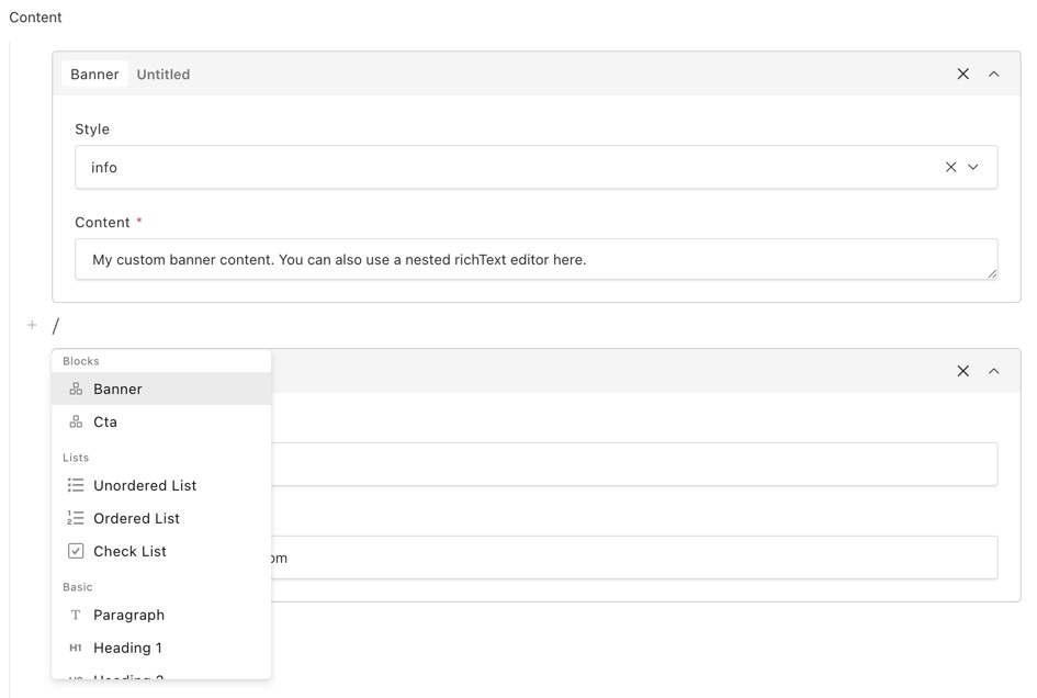
To add blocks to your Lexical editor, include the BlocksFeature in your editor configuration:
Blocks use the same configuration schema as Blocks within Payload's Blocks Field.
Blocks vs Inline Blocks

The BlocksFeature supports two types of blocks:
Blocks
Regular blocks are block-level elements that take up an entire line, similar to paragraphs or headings. They cannot be placed inline with text.
Use blocks for:
- Call-to-action sections
- Image galleries
- Code snippets
- Embedded content (videos, maps)
- Any component that should stand alone
Inline Blocks
Inline blocks can be inserted within text, appearing alongside other content in the same paragraph. They're useful for elements that need to flow with text.
Use inline blocks for:
- Mentions (@user)
- Custom badges or tags
- Inline icons or emojis
- Variable placeholders
- Footnote references
Data Structure
Block data is stored within the Lexical JSON structure. Each block node contains a fields object with all the block's field values:
Inline blocks follow a similar structure with type: "inlineBlock".
Custom Block Components
You can customize how blocks appear in the editor by providing custom React components. This is useful when you want a more visual representation of your block content.
Block Components

For regular blocks, use the admin.components.Block property to provide a custom component:
Your custom component can use composable primitives from @payloadcms/richtext-lexical/client. These components automatically receive block data from context, so you can use them to recreate the default block UI or arrange them in custom layouts:
The BlockCollapsible component automatically renders an edit button that opens a drawer with the block's fields. You can customize this behavior by passing props like removeButton={false} to hide the default remove button and render it yourself.
You can also choose to render something completely different in your custom block component:

Inline Block Components
For inline blocks, similar composable primitives are available:

Or, you can choose to render something completely different in your custom inline block component, for example a badge with a username:

Label Components
You can also customize the label shown in the block header using admin.components.Label. This is useful for displaying dynamic information based on the block's field values.
Block Label:

Inline Block Label:

Example: Pre-made CodeBlock
For a real-world example of a custom block component, see the source code for Payload's pre-made CodeBlock. It's a standard block with a custom admin.components.Block component that uses the same APIs documented above—including useFormFields, BlockCollapsible, and the helper buttons.
TypeScript
When building custom block components, you can import the following types for proper typing:
Type | Use Case |
|---|---|
| Client component for |
| Server component for |
| Client component for |
| Server component for |
| Client component for inline |
| Server component for inline |
| Client component for inline |
| Server component for inline |
Rendering Blocks
When rendering rich text content on the frontend, blocks need to be handled by your converter configuration. See the following guides for details:
- JSX Converters - For React/Next.js applications
- HTML Converters - For static HTML output
- Markdown Converters - For markdown output
Each converter allows you to define custom renderers for your block types, giving you full control over how block content appears on your frontend.
Code Block
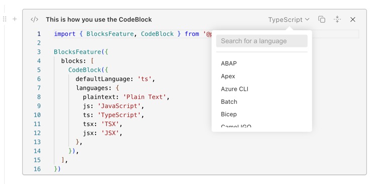
Payload provides a pre-built CodeBlock that you can use directly in your projects. It includes syntax highlighting, language selection, and optional TypeScript type definitions support:
CodeBlock Options
Option | Description |
|---|---|
| Override the block slug. Default: |
| The default language selection. Default: first key in |
| Object mapping language keys to display labels |
| TypeScript-specific configuration (see below) |
| Partial block config to override or extend the default CodeBlock |
TypeScript Support
When using TypeScript as a language option, you can load external type definitions to provide IntelliSense in the editor:
TypeScript Option | Description |
|---|---|
| Array of |
| Module path mappings for import resolution |
| Directories to search for type definitions. Default: |
| TypeScript compilation target. Default: |
| Enable full type checking (not just syntax). Default: |
Was this page helpful?