Official Features
Below are all the Rich Text Features Payload offers. Everything is customizable; you can create your own features, modify ours and share them with the community.
Features Overview
Feature Name | Included by default | Description |
|---|---|---|
| Yes | Adds support for bold text formatting. |
| Yes | Adds support for italic text formatting. |
| Yes | Adds support for underlined text formatting. |
| Yes | Adds support for strikethrough text formatting. |
| Yes | Adds support for subscript text formatting. |
| Yes | Adds support for superscript text formatting. |
| Yes | Adds support for inline code formatting. |
| Yes | Provides entries in both the slash menu and toolbar dropdown for explicit paragraph creation or conversion. |
| Yes | Adds Heading Nodes (by default, H1 - H6, but that can be customized) |
| Yes | Adds support for text alignment (left, center, right, justify) |
| Yes | Adds support for text indentation with toolbar buttons |
| Yes | Adds support for unordered lists (ul) |
| Yes | Adds support for ordered lists (ol) |
| Yes | Adds support for interactive checklists |
| Yes | Allows you to create internal and external links |
| Yes | Allows you to create block-level (not inline) relationships to other documents |
| Yes | Allows you to create block-level quotes |
| Yes | Allows you to create block-level upload nodes - this supports all kinds of uploads, not just images |
| Yes | Adds support for horizontal rules / separators. Basically displays an |
| Yes | Provides a floating toolbar which appears when you select text. This toolbar only contains actions relevant for selected text |
| No | Provides a persistent toolbar pinned to the top and always visible. Both inline and fixed toolbars can be enabled at the same time. |
| No | Allows you to use Payload's Blocks Field directly inside your editor. In the feature props, you can specify the allowed blocks - just like in the Blocks field. |
| No | Provides a debug box under the editor, which allows you to see the current editor state live, the dom, as well as time travel. Very useful for debugging |
| No | Adds support for tables. This feature may be removed or receive breaking changes in the future - even within a stable lexical release, without needing a major release. |
| No | Allows you to store key-value attributes within TextNodes and assign them inline styles. |
In depth
BoldFeature
- Description: Adds support for bold text formatting, along with buttons to apply it in both fixed and inline toolbars.
- Included by default: Yes
- Markdown Support:
**bold**or__bold__ - Keyboard Shortcut: Ctrl/Cmd + B
ItalicFeature
- Description: Adds support for italic text formatting, along with buttons to apply it in both fixed and inline toolbars.
- Included by default: Yes
- Markdown Support:
*italic*or_italic_ - Keyboard Shortcut: Ctrl/Cmd + I
UnderlineFeature
- Description: Adds support for underlined text formatting, along with buttons to apply it in both fixed and inline toolbars.
- Included by default: Yes
- Keyboard Shortcut: Ctrl/Cmd + U
StrikethroughFeature
- Description: Adds support for strikethrough text formatting, along with buttons to apply it in both fixed and inline toolbars.
- Included by default: Yes
- Markdown Support:
~~strikethrough~~
SubscriptFeature
- Description: Adds support for subscript text formatting, along with buttons to apply it in both fixed and inline toolbars.
- Included by default: Yes
SuperscriptFeature
- Description: Adds support for superscript text formatting, along with buttons to apply it in both fixed and inline toolbars.
- Included by default: Yes
InlineCodeFeature
- Description: Adds support for inline code formatting with distinct styling, along with buttons to apply it in both fixed and inline toolbars.
- Included by default: Yes
- Markdown Support: `code`
ParagraphFeature
- Description: Provides entries in both the slash menu and toolbar dropdown for explicit paragraph creation or conversion.
- Included by default: Yes
HeadingFeature
- Description: Adds support for heading nodes (H1-H6) with toolbar dropdown and slash menu entries for each enabled heading size.
- Included by default: Yes
- Markdown Support:
#,##,###, ..., at start of line. - Types:
- Usage example:
AlignFeature
- Description: Allows text alignment (left, center, right, justify), along with buttons to apply it in both fixed and inline toolbars.
- Included by default: Yes
- Keyboard Shortcut: Ctrl/Cmd + Shift + L/E/R/J (left/center/right/justify)
IndentFeature
- Description: Adds support for text indentation, along with buttons to apply it in both fixed and inline toolbars.
- Included by default: Yes
- Keyboard Shortcut: Tab (increase), Shift + Tab (decrease)
- Types:
- Usage example:
UnorderedListFeature
- Description: Adds support for unordered lists (bullet points) with toolbar dropdown and slash menu entries.
- Included by default: Yes
- Markdown Support:
-,*, or+at start of line
OrderedListFeature
- Description: Adds support for ordered lists (numbered lists) with toolbar dropdown and slash menu entries.
- Included by default: Yes
- Markdown Support:
1.at start of line
ChecklistFeature
- Description: Adds support for interactive checklists with toolbar dropdown and slash menu entries.
- Included by default: Yes
- Markdown Support:
- [ ](unchecked) or- [x](checked)
LinkFeature
- Description: Allows creation of internal and external links with toolbar buttons and automatic URL conversion.
- Included by default: Yes
- Markdown Support:
[anchor](url) - Types:
- Usage example:
RelationshipFeature
- Description: Allows creation of block-level relationships to other documents with toolbar button and slash menu entry.
- Included by default: Yes
- Types:
- Usage example:
UploadFeature
- Description: Allows creation of upload/media nodes with toolbar button and slash menu entry, supports all file types.
- Included by default: Yes
- Types:
- Usage example:
BlockquoteFeature
- Description: Allows creation of blockquotes with toolbar button and slash menu entry.
- Included by default: Yes
- Markdown Support:
> quote text
HorizontalRuleFeature
- Description: Adds support for horizontal rules/separators with toolbar button and slash menu entry.
- Included by default: Yes
- Markdown Support:
---
InlineToolbarFeature
- Description: Provides a floating toolbar that appears when text is selected, containing formatting options relevant to selected text.
- Included by default: Yes
FixedToolbarFeature
- Description: Provides a persistent toolbar pinned to the top of the editor that's always visible.
- Included by default: No
- Types:
- Usage example:
BlocksFeature
- Description: Allows use of Payload's Blocks Field directly in the editor with toolbar buttons and slash menu entries for each block type. Supports both block-level and inline blocks.
- Included by default: No
For complete documentation including custom block components, the pre-built CodeBlock, and rendering blocks on the frontend, see the dedicated Blocks documentation.
TreeViewFeature
- Description: Provides a debug panel below the editor showing the editor's internal state, DOM tree, and time travel debugging.
- Included by default: No
EXPERIMENTAL_TableFeature
- Description: Adds support for tables with toolbar button and slash menu entry for creation and editing.
- Included by default: No
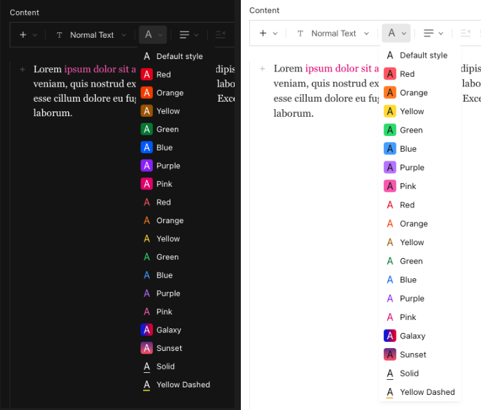
TextStateFeature
- Description: Allows storing key-value attributes in text nodes with inline styles and toolbar dropdown for style selection.
- Included by default: No
- Types:
- Usage example:
This is what the example above will look like:
Rendering on the frontend
When Lexical serializes a text node that has state applied, the state is stored under a "$" key in the node object. To apply the styles when rendering rich text on your frontend, you need a custom text JSX converter that reads from this key and maps the values back to your CSS config.
Step 1 — Share your state config
Extract your TextStateFeature state into a file with no package imports so it can be safely imported in both server and client contexts:
Then reference it in your field config:
Step 2 — Add a custom text converter
When using RichText from @payloadcms/richtext-lexical/react, override the default text converter to read the "$" key and apply the corresponding CSS as inline styles:
The key insight is that textStateConfig is the single source of truth — it is passed directly to TextStateFeature in your field config and also imported by your frontend converter to resolve the CSS values at render time.
Was this page helpful?