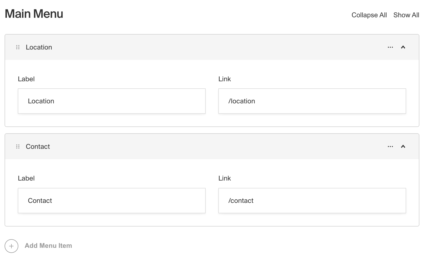
Array Field

Example uses:
- A "slider" with an image (upload field) and a caption (text field)
- Navigational structures where editors can specify nav items containing pages (relationship field), an "open in new tab" checkbox field
- Event agenda "timeslots" where you need to specify start & end time (date field), label (text field), and Learn More page relationship
Config
Option | Description |
|---|---|
| To be used as the property name when stored and retrieved from the database. More |
| Text used as the heading in the Admin panel or an object with keys for each language. Auto-generated from name if not defined. |
| Array of field types to correspond to each row of the Array. |
| Provide a custom validation function that will be executed on both the Admin panel and the backend. More |
| A number for the fewest allowed items during validation when a value is present. |
| A number for the most allowed items during validation when a value is present. |
| If this field is top-level and nested in a config supporting Authentication, include its data in the user JWT. |
| Provide field-based hooks to control logic for this field. More |
| Provide field-based access control to denote what users can see and do with this field's data. More |
| Restrict this field's visibility from all APIs entirely. Will still be saved to the database, but will not appear in any API or the Admin panel. |
| Provide an array of row data to be used for this field's default value. More |
| Enable localization for this field. Requires localization to be enabled in the Base config. If enabled, a separate, localized set of all data within this Array will be kept, so there is no need to specify each nested field as |
| Require this field to have a value. |
| Customize the row labels appearing in the Admin dashboard. |
| Admin-specific configuration. See below for more detail. |
| Extension point for adding custom data (e.g. for plugins) |
| Create a top level, reusable Typescript interface & GraphQL type. |
| Custom table name for the field when using SQL database adapter (Postgres). Auto-generated from name if not defined. |
* An asterisk denotes that a property is required.
Admin Config
In addition to the default field admin config, you can adjust the following properties:
Option | Description |
|---|---|
| Set the initial collapsed state |
| Disable array order sorting by setting this value to |
| Function or React component to be rendered as the label on the array row. Receives |
Example
collections/ExampleCollection.ts