Collapsible Field
The Collapsible Field is presentational-only and only affects the Admin Panel. By using it, you can place fields within a nice layout component that can be collapsed / expanded.
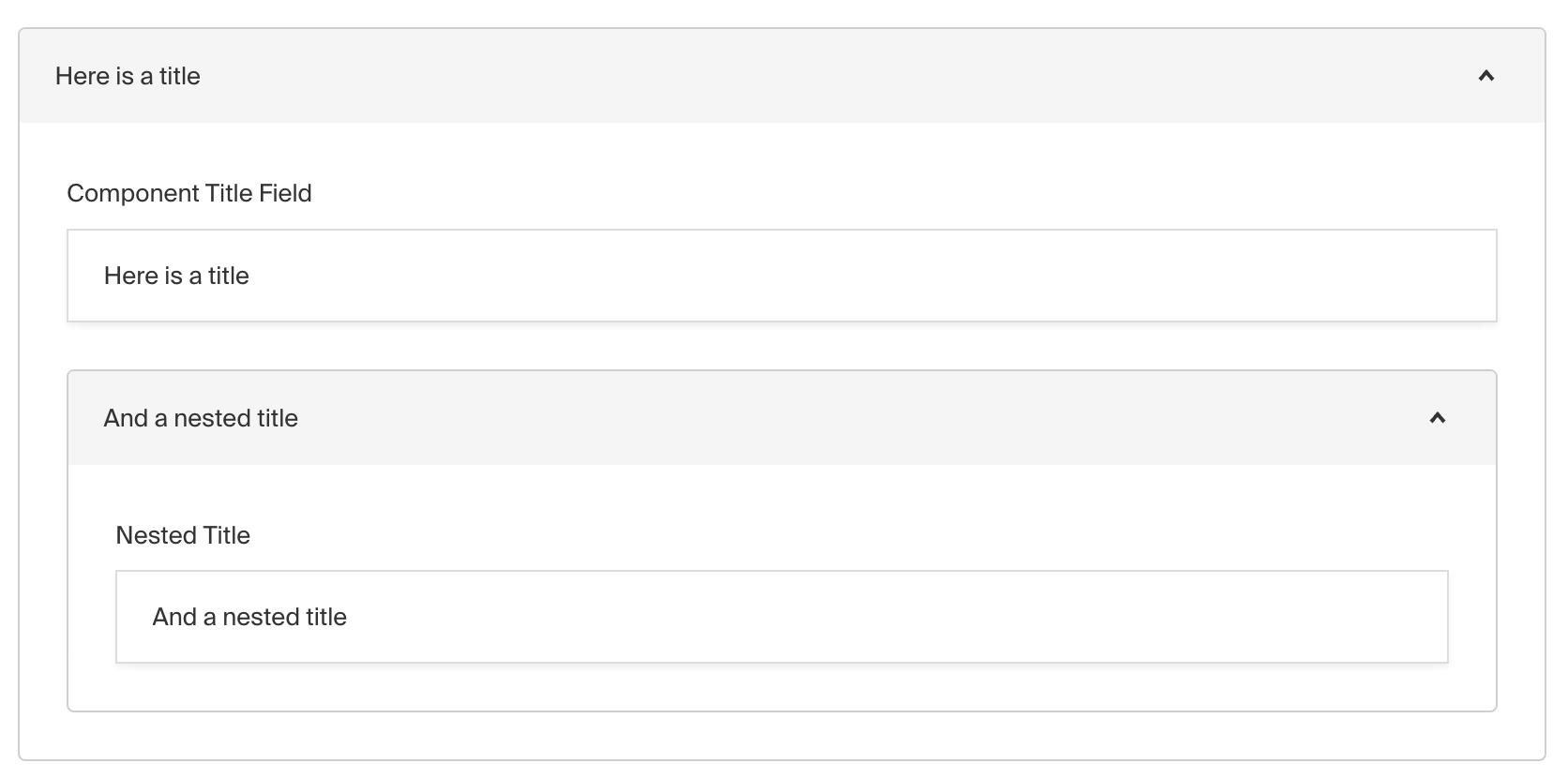
Admin Panel screenshot of a Collapsible field
To add a Collapsible Field, set the type to collapsible in your Field Config:
1
import type { Field } from 'payload'
2
3
export const MyCollapsibleField: Field = {
4
// ...
5
type: 'collapsible',
6
fields: [
7
// ...
8
],
9
}
Config Options
| Option | Description |
|---|---|
label * | A label to render within the header of the collapsible component. This can be a string, function or react component. Function/components receive ({ data, path }) as args. |
fields * | Array of field types to nest within this Collapsible. |
admin | Admin-specific configuration. More details. |
custom | Extension point for adding custom data (e.g. for plugins) |
* An asterisk denotes that a property is required.
Admin Options
The customize the appearance and behavior of the Collapsible Field in the Admin Panel, you can use the admin option:
1
import type { Field } from 'payload'
2
3
export const MyCollapsibleField: Field = {
4
// ...
5
admin: {
6
// ...
7
},
8
}
The Collapsible Field inherits all of the default options from the base Field Admin Config, plus the following additional options:
| Option | Description |
|---|---|
initCollapsed | Set the initial collapsed state |
Example
collections/ExampleCollection.ts
1
import type { CollectionConfig } from 'payload'
2
3
export const ExampleCollection: CollectionConfig = {
4
slug: 'example-collection',
5
fields: [
6
{
7
label: ({ data }) => data?.title || 'Untitled',
8
type: 'collapsible', // required
9
fields: [
10
// required
11
{
12
name: 'title',
13
type: 'text',
14
required: true,
15
},
16
{
17
name: 'someTextField',
18
type: 'text',
19
required: true,
20
},
21
],
22
},
23
],
24
}
Next