Date Field
The Date Field saves a Date in the database and provides the Admin Panel with a customizable time picker interface.
To add a Date Field, set the type to date in your Field Config:
Config Options
Option | Description |
|---|---|
| To be used as the property name when stored and retrieved from the database. More details. |
| Text used as a field label in the Admin Panel or an object with keys for each language. |
| Build an index for this field to produce faster queries. Set this field to |
| Provide a custom validation function that will be executed on both the Admin Panel and the backend. More details. |
| If this field is top-level and nested in a config supporting Authentication, include its data in the user JWT. |
| Provide Field Hooks to control logic for this field. More details. |
| Provide Field Access Control to denote what users can see and do with this field's data. More details. |
| Restrict this field's visibility from all APIs entirely. Will still be saved to the database, but will not appear in any API or the Admin Panel. |
| Provide data to be used for this field's default value. More details. |
| Enable localization for this field. Requires localization to be enabled in the Base config. |
| Require this field to have a value. |
| Admin-specific configuration. More details. |
| Extension point for adding custom data (e.g. for plugins) |
| Set to |
| Override field type generation with providing a JSON schema |
| Provide |
* An asterisk denotes that a property is required.
Admin Options
To customize the appearance and behavior of the Date Field in the Admin Panel, you can use the admin option:
The Date Field inherits all of the default admin options from the base Field Admin Config, plus the following additional options:
Property | Description |
|---|---|
| Placeholder text for the field. |
| Pass options to customize date field appearance. |
| Format date to be shown in field cell. |
| Determines the appearance of the datepicker: |
| Number of months to display max is 2. Defaults to 1. |
| Min date value to allow. |
| Max date value to allow. |
| Min time value to allow. |
| Max date value to allow. |
| Pass any valid props directly to the react-datepicker |
| Time intervals to display. Defaults to 30 minutes. |
| Determines time format. Defaults to |
* This property is passed directly to react-datepicker.
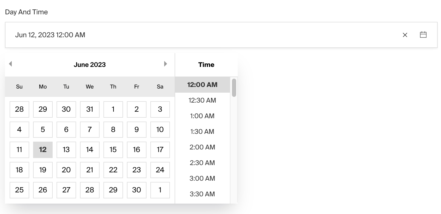
Display Format and Picker Appearance
These properties only affect how the date is displayed in the UI. The full date is always stored in the format YYYY-MM-DDTHH:mm:ss.SSSZ (e.g. 1999-01-01T8:00:00.000+05:00).
displayFormat determines how the date is presented in the field cell, you can pass any valid unicode date format.
pickerAppearance sets the appearance of the react datepicker, the options available are dayAndTime, dayOnly, timeOnly, and monthOnly. By default, the datepicker will display dayOnly.
When only pickerAppearance is set, an equivalent format will be rendered in the date field cell. To overwrite this format, set displayFormat.
Example
Custom Components
Field
Server Component
Client Component
Label
Server Component
Client Component
Timezones
To enable timezone selection on a Date field, set the timezone property to true:
This will add a dropdown to the date picker that allows users to select a timezone. The selected timezone will be saved in the database along with the date in a new column named date_tz.
You can customise the available list of timezones in the global admin config or on the field config itself which accepts the following config as well:
Property | Description |
|---|---|
| A value for the default timezone to be set. |
| An array of supported timezones with label and value object. |
| If true, the timezone selection will be required even if the date is not. |
| A function to customize the generated timezone field. More details |
Timezone Override
The override function allows you to customize the auto-generated timezone select field at a granular level. This is useful when you need to modify admin options like visibility, descriptions, or other field properties.
The override function receives an object with baseField (the default timezone select field) and must return a valid field configuration. The base field includes:
name: The timezone field name (e.g.,publishedAt_tz)type: Always'select'options: The available timezone optionsdefaultValue: The default timezone valuerequired: Whether the timezone is requiredlabel: Auto-generated from the parent field's label (e.g., "Published At Tz")admin.hidden:trueby default
Custom UTC Offsets
In addition to IANA timezone names (like America/New_York), you can also use fixed UTC offsets in the ±HH:mm format:
You can also mix IANA timezones with custom UTC offsets:
GraphQL Enum Names
When using offset timezones with GraphQL, the offset values are transformed to valid GraphQL enum names using the _TZOFFSET_ prefix:
Offset Value | GraphQL Enum Name |
|---|---|
| |
| |
| |
Similarly, IANA timezone names are also transformed (e.g., America/New_York becomes America_New_York).
The actual value (+05:30) is stored in the database and returned by the REST API.
Was this page helpful?