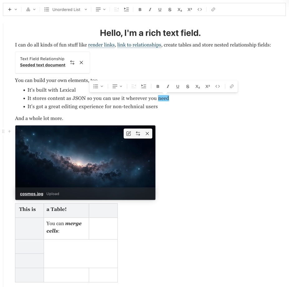
The Admin component is built on the powerful slatejs
editor and is meant to be as extensible and customizable as possible.
Option | Description |
---|---|
name * | To be used as the property name when stored and retrieved from the database. More |
label | Text used as a field label in the Admin panel or an object with keys for each language. |
validate | Provide a custom validation function that will be executed on both the Admin panel and the backend. More |
saveToJWT | If this field is top-level and nested in a config supporting Authentication, include its data in the user JWT. |
hooks | Provide field-based hooks to control logic for this field. More |
access | Provide field-based access control to denote what users can see and do with this field's data. More |
hidden | Restrict this field's visibility from all APIs entirely. Will still be saved to the database, but will not appear in any API or the Admin panel. |
defaultValue | Provide data to be used for this field's default value. More |
localized | Enable localization for this field. Requires localization to be enabled in the Base config. |
required | Require this field to have a value. |
admin | Admin-specific configuration. See below for more detail. |
custom | Extension point for adding custom data (e.g. for plugins) |
* An asterisk denotes that a property is required.
In addition to the default field admin config, the Rich Text editor allows for the following admin properties:
placeholder
Set this property to define a placeholder string in the text input.
elements
The elements
property is used to specify which built-in or custom SlateJS elements should be made available to the field within the admin panel.
The default elements
available in Payload are:
h1
h2
h3
h4
h5
h6
blockquote
link
ol
ul
textAlign
indent
relationship
upload
textAlign
leaves
The leaves
property specifies built-in or custom SlateJS leaves to be enabled within the Admin panel.
The default leaves
available in Payload are:
bold
code
italic
strikethrough
underline
hideGutter
Set this property to true
to hide this field's gutter within the admin panel. The field gutter is rendered as a vertical line and padding, but often if this field is nested within a Group, Block, or Array, you may want to hide the gutter.
link.fields
This allows fields to be saved as extra fields on a link inside the Rich Text Editor. When this is present, the fields will render inside a modal that can be opened by clicking the "edit" button on the link element.
link.fields
may either be an array of fields (in which case all fields defined in it will be appended below the default fields) or a function that accepts the default fields as only argument and returns an array defining the entirety of fields to be used (thus providing a mechanism of overriding the default fields).
RichText link with custom fields
upload.collections[collection-name].fields
This allows fields to be saved as meta data on an upload field inside the Rich Text Editor. When this is present, the fields will render inside a modal that can be opened by clicking the "edit" button on the upload element.
RichText field using the upload element
RichText upload element modal displaying fields from the config
The built-in relationship
element is a powerful way to reference other Documents directly within your Rich Text editor.
Similar to the relationship
element, the upload
element is a user-friendly way to reference Upload-enabled collections with a UI specifically designed for media / image-based uploads.
Relationship and Upload elements are populated dynamically into your Rich Text field' content. Within the REST and Local APIs, any present RichText relationship
or upload
elements will respect the depth
option that you pass, and will be populated accordingly. In GraphQL, each richText
field accepts an argument of depth
for you to utilize.
Text Alignment is not included by default and can be added to a Rich Text Editor by adding textAlign
to the list of elements. TextAlign will alter the existing element to include a new textAlign
field in the resulting JSON. This field can be used in combination with other elements and leaves to position content to the left, center or right.
To specify which default elements or leaves should be allowed to be used for this field, define arrays that contain string names for each element or leaf you wish to enable. To specify a custom element or leaf, pass an object with all corresponding properties as outlined below. View the example to reference how this all works.
You can design and build your own Slate elements and leaves to extend the editor with your own functionality. To do so, first start by reading the SlateJS documentation and looking at the Slate examples to familiarize yourself with the SlateJS editor as a whole.
Once you're up to speed with the general concepts involved, you can pass in your own elements and leaves to your field's admin config.
Both custom elements and leaves are defined via the following config:
Property | Description |
---|---|
name * | The default name to be used as a type for this element. |
Button * | A React component to be rendered in the Rich Text toolbar. |
plugins | An array of plugins to provide to the Rich Text editor. |
type | A type that overrides the default type used by name |
Custom Element
s also require the Element
property set to a React component to be rendered as the Element
within the rich text editor itself.
Custom Leaf
objects follow a similar pattern but require you to define the Leaf
property instead.
Specifying custom Type
s let you extend your custom elements by adding additional fields to your JSON object.
collections/ExampleCollection.ts
For more examples regarding how to define your own elements and leaves, check out the example RichText
field within the Public Demo source code.
As the Rich Text field saves its content in a JSON format, you'll need to render it as HTML yourself. Here is an example for how to generate JSX / HTML from Rich Text content:
Payload comes with a few built-in SlateJS plugins which can be extended to make developing your own elements and leaves a bit easier. They will be documented here over time.
shouldBreakOutOnEnter
Payload's built-in heading elements all allow a "hard return" to "break out" of the currently active element. For example, if you hit enter
while typing an h1
, the h1
will be "broken out of" and you'll be able to continue writing as the default paragraph element.
If you want to utilize this functionality within your own custom elements, you can do so by adding a custom plugin to your element
like the following "large body" element example:
customLargeBodyElement.js
:
Above, you can see that we are creating a custom SlateJS element with a name of large-body
. This might render a slightly larger body copy on the frontend of your app(s). We pass it a name, button, and element—but additionally, we pass it a plugins
array containing a single SlateJS plugin.
The plugin itself extends Payload's built-in shouldBreakOutOnEnter
Slate function to add its own element name to the list of elements that should "break out" when the enter
key is pressed.
If you are building your own custom Rich Text elements or leaves, you may benefit from importing the following types: