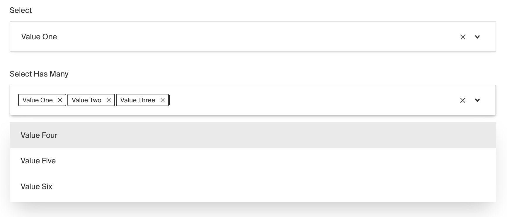
Select Field
The Select Field provides a dropdown-style interface for choosing options from a predefined list as an enumeration.

To add a Select Field, set the type to select in your Field Config:
Config Options
| Option | Description |
|---|---|
name * | To be used as the property name when stored and retrieved from the database. More |
options * | Array of options to allow the field to store. Can either be an array of strings, or an array of objects containing a label string and a value string. |
hasMany | Boolean when, if set to true, allows this field to have many selections instead of only one. |
label | Text used as a field label in the Admin Panel or an object with keys for each language. |
unique | Enforce that each entry in the Collection has a unique value for this field. |
validate | Provide a custom validation function that will be executed on both the Admin Panel and the backend. More |
index | Build an index for this field to produce faster queries. Set this field to true if your users will perform queries on this field's data often. |
saveToJWT | If this field is top-level and nested in a config supporting Authentication, include its data in the user JWT. |
hooks | Provide Field Hooks to control logic for this field. More details. |
access | Provide Field Access Control to denote what users can see and do with this field's data. More details. |
hidden | Restrict this field's visibility from all APIs entirely. Will still be saved to the database, but will not appear in any API or the Admin Panel. |
defaultValue | Provide data to be used for this field's default value. More |
localized | Enable localization for this field. Requires localization to be enabled in the Base config. |
required | Require this field to have a value. |
admin | Admin-specific configuration. See the default field admin config for more details. |
custom | Extension point for adding custom data (e.g. for plugins) |
enumName | Custom enum name for this field when using SQL Database Adapter (Postgres). Auto-generated from name if not defined. |
dbName | Custom table name (if hasMany set to true) for this field when using SQL Database Adapter (Postgres). Auto-generated from name if not defined. |
typescriptSchema | Override field type generation with providing a JSON schema |
virtual | Provide true to disable field in the database. See Virtual Fields |
* An asterisk denotes that a property is required.
Admin Options
The customize the appearance and behavior of the Select Field in the Admin Panel, you can use the admin option:
The Select Field inherits all of the default options from the base Field Admin Config, plus the following additional options:
| Property | Description |
|---|---|
isClearable | Set to true if you'd like this field to be clearable within the Admin UI. |
isSortable | Set to true if you'd like this field to be sortable within the Admin UI using drag and drop. (Only works when hasMany is set to true) |
Example
collections/ExampleCollection.ts
Customization
The Select field UI component can be customized by providing a custom React component to the components object in the Base config.
You can import the existing Select component directly from Payload, then extend and customize it as needed.
If you are looking to create a dynamic select field, the following tutorial will walk you through the process of creating a custom select field that fetches its options from an external API.
If you want to learn more about custom components check out the Admin > Custom Component docs.