Was this page helpful?
Next
Was this page helpful?
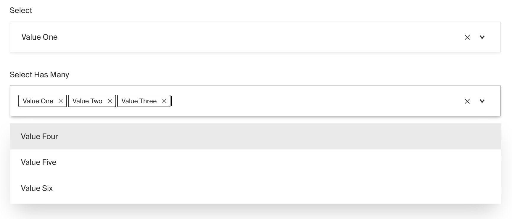
The Select Field provides a dropdown-style interface for choosing options from a predefined list as an enumeration.
To add a Select Field, set the type to select in your Field Config:
Option | Description |
|---|---|
| To be used as the property name when stored and retrieved from the database. More details. |
| Array of options to allow the field to store. Can either be an array of strings, or an array of objects containing a |
| Boolean when, if set to |
| Text used as a field label in the Admin Panel or an object with keys for each language. |
| Enforce that each entry in the Collection has a unique value for this field. This creates a database-level unique index on the field's path. More details. |
| Provide a custom validation function that will be executed on both the Admin Panel and the backend. More details. |
| Build an index for this field to produce faster queries. Set this field to |
| If this field is top-level and nested in a config supporting Authentication, include its data in the user JWT. |
| Provide Field Hooks to control logic for this field. More details. |
| Provide Field Access Control to denote what users can see and do with this field's data. More details. |
| Restrict this field's visibility from all APIs entirely. Will still be saved to the database, but will not appear in any API or the Admin Panel. |
| Provide data to be used for this field's default value. More details. |
| Enable localization for this field. Requires localization to be enabled in the Base config. |
| Require this field to have a value. |
| Admin-specific configuration. See the default field admin config for more details. |
| Extension point for adding custom data (e.g. for plugins) |
| Custom enum name for this field when using SQL Database Adapter (Postgres). Auto-generated from name if not defined. |
| Custom table name (if |
| Create a top level, reusable Typescript interface & GraphQL type. |
| Dynamically filter which options are available based on the user, data, etc. More details |
| Override field type generation with providing a JSON schema |
| Provide |
* An asterisk denotes that a property is required.
Used to dynamically filter which options are available based on the current user, document data, or other criteria.
Some examples of this might include:
The result of filterOptions will determine:
To do this, use the filterOptions property in your Field Config:
To customize the appearance and behavior of the Select Field in the Admin Panel, you can use the admin option:
The Select Field inherits all of the default admin options from the base Field Admin Config, plus the following additional options:
Property | Description |
|---|---|
| Set to |
| Set to |
| Define a custom text or function to replace the generic default placeholder |