Array Field
The Array Field is used when you need to have a set of "repeating" Fields. It stores an array of objects containing fields that you define. These fields can be of any type, including other arrays, to achieve infinitely nested data structures.
Arrays are useful for many different types of content from simple to complex, such as:
- A "slider" with an image (upload field) and a caption (text field)
- Navigational structures where editors can specify nav items containing pages (relationship field), an "open in new tab" checkbox field
- Event agenda "timeslots" where you need to specify start & end time (date field), label (text field), and Learn More page relationship
To create an Array Field, set the type to array in your Field Config:
Config Options
Option | Description |
|---|---|
| To be used as the property name when stored and retrieved from the database. More details. |
| Text used as the heading in the Admin Panel or an object with keys for each language. Auto-generated from name if not defined. |
| Array of field types to correspond to each row of the Array. |
| Provide a custom validation function that will be executed on both the Admin Panel and the backend. More details. |
| A number for the fewest allowed items during validation when a value is present. |
| A number for the most allowed items during validation when a value is present. |
| If this field is top-level and nested in a config supporting Authentication, include its data in the user JWT. |
| Provide Field Hooks to control logic for this field. More details. |
| Provide Field Access Control to denote what users can see and do with this field's data. More details. |
| Restrict this field's visibility from all APIs entirely. Will still be saved to the database, but will not appear in any API or the Admin Panel. |
| Provide an array of row data to be used for this field's default value. More details. |
| Enable localization for this field. Requires localization to be enabled in the Base config. If enabled, a separate, localized set of all data within this Array will be kept, so there is no need to specify each nested field as |
| Require this field to have a value. |
| Customize the row labels appearing in the Admin dashboard. |
| Admin-specific configuration. More details. |
| Extension point for adding custom data (e.g. for plugins) |
| Create a top level, reusable Typescript interface & GraphQL type. |
| Custom table name for the field when using SQL Database Adapter (Postgres). Auto-generated from name if not defined. |
| Override field type generation with providing a JSON schema |
| Provide |
* An asterisk denotes that a property is required.
Admin Options
To customize the appearance and behavior of the Array Field in the Admin Panel, you can use the admin option:
The Array Field inherits all of the default admin options from the base Field Admin Config, plus the following additional options:
Option | Description |
|---|---|
| Set the initial collapsed state |
| React component to be rendered as the label on the array row. Example |
| Disable order sorting by setting this value to |
Example
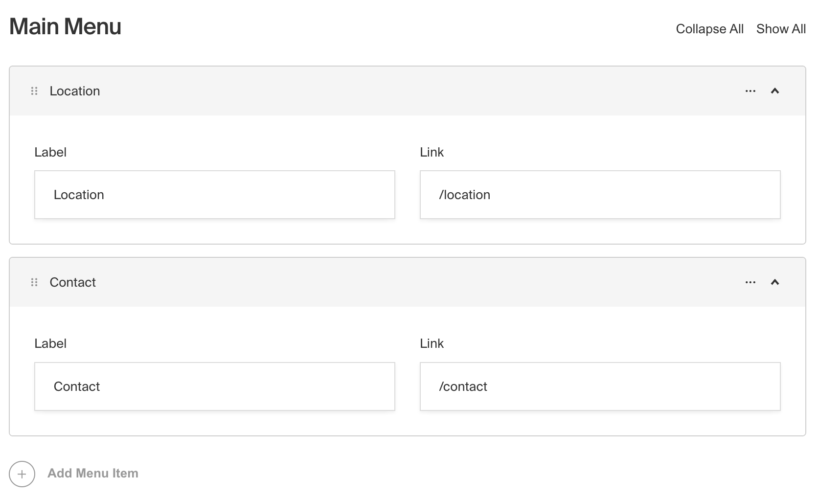
In this example, we have an Array Field called slider that contains a set of fields for a simple image slider. Each row in the array has a title, image, and caption. We also customize the row label to display the title if it exists, or a default label if it doesn't.
Custom Components
Field
Server Component
Client Component
Label
Server Component
Client Component
Row Label
Was this page helpful?